Colour as a contrast
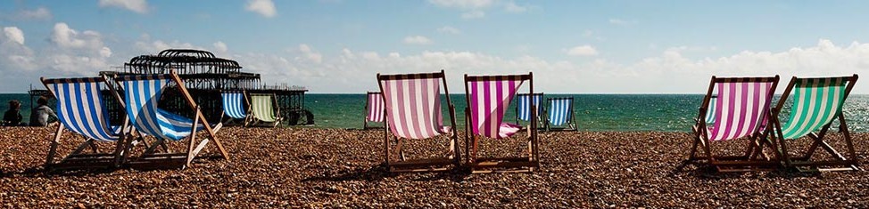
Over the last couple of months I’ve been researching the use of colour difference (contrast) as a tool for the photographer or artist to use to help direct the viewers attention to a particular element in a picture. I thought I knew what the answers to my questions would be and had almost finished the original article, while I was waiting for enough responses to the surveys to “support” my conjectures, when something strange happened. I didn’t get the answers that I was expecting. As a bit of a science geek, I was both disappointed and excited at the same time.
To download the PDF on “colour”, click colour. The password is reddress. It has cost me time and money to prepare this article and if you feel that you’d like to buy me a coffee, please feel free to contribute to my caffeine fund.
[cpDonation key=’2′]
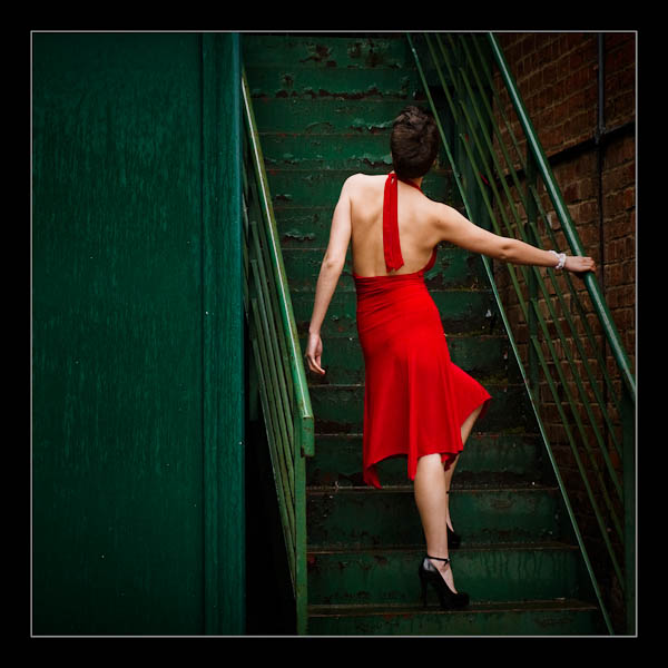
A very interesting article Simon. And I can sum up by saying if I feel the need to get some shots for Liverpudlians, make sure they are bright red on a green background with no hint of blue.
I will be adding to your coffee fund.k
Unless they are Everton supporters Keith 🙂
All best Si.